Tansy Kember.
I
enjoy creating designs that will intrigue the viewer and attract their focus. I
have a strong interest in branding as well as photography and enjoy
incorporating my photography into my design work.
Email: tkemberdesign@hotmail.com
Phone: 0476 156 892
Website: www.behance.net/tansykemberdesigns/
Social: @tansykember.designs
Interview.
Hobby outside of design?
My biggest hobby outside of design would
probably be going out to eat at as many restaurants as possible.
What type of design do you enjoy the most?
I think my favorite type of design would have to be branding. I also always enjoy designs where I am able to incorporate my photography into designs.
Looking through your portfolio, what is one piece of work that you
are really proud of and why?
I think the piece of design that am most proud of would be my poster for the Commission on Excellence and Innovation in Health. I am most proud of this poster because it was submitted for their digital image competition and my poster was selected as the winner. This is something that I am very proud of as I never thought that I would be able to win a design competition like this.
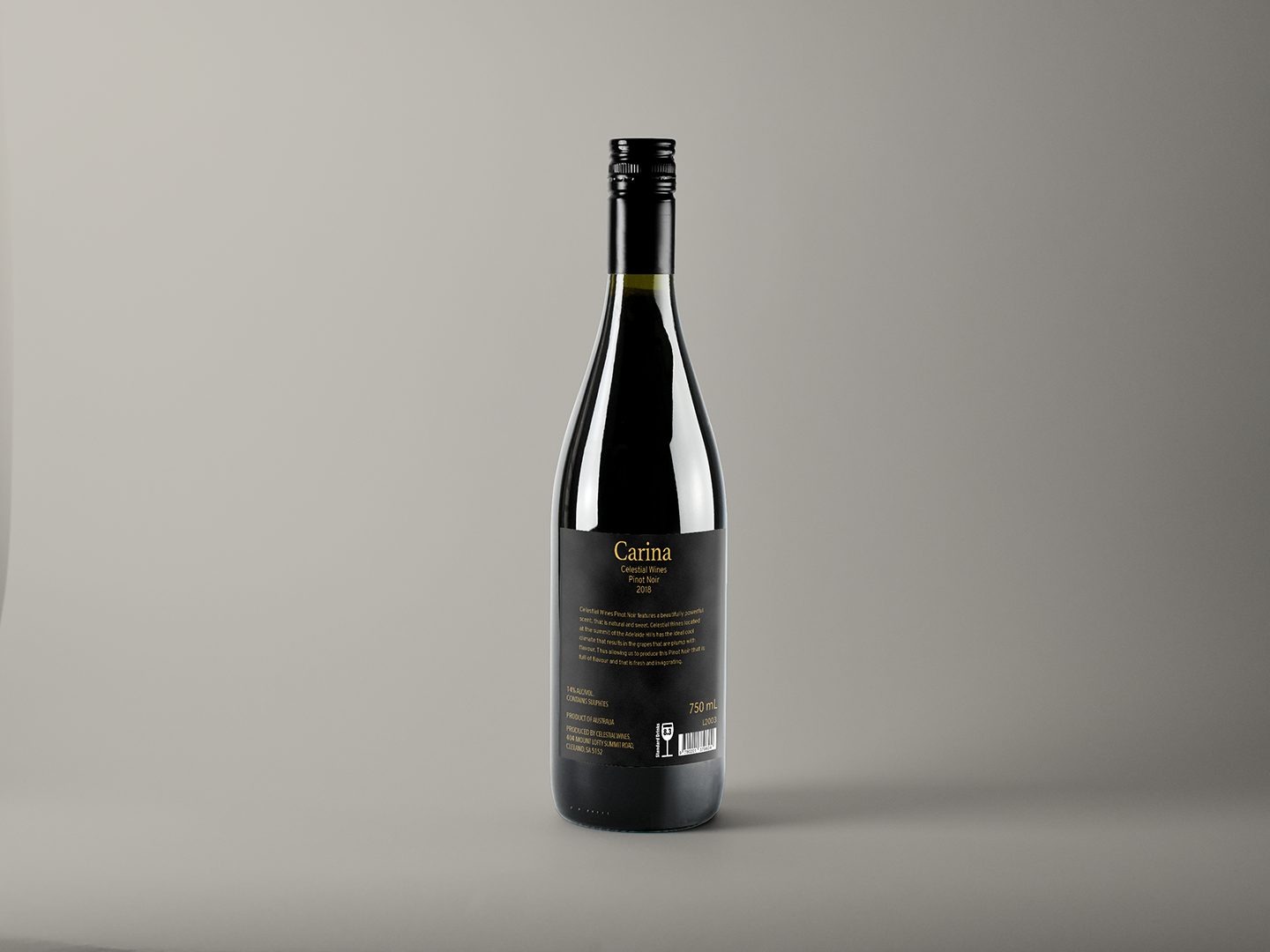


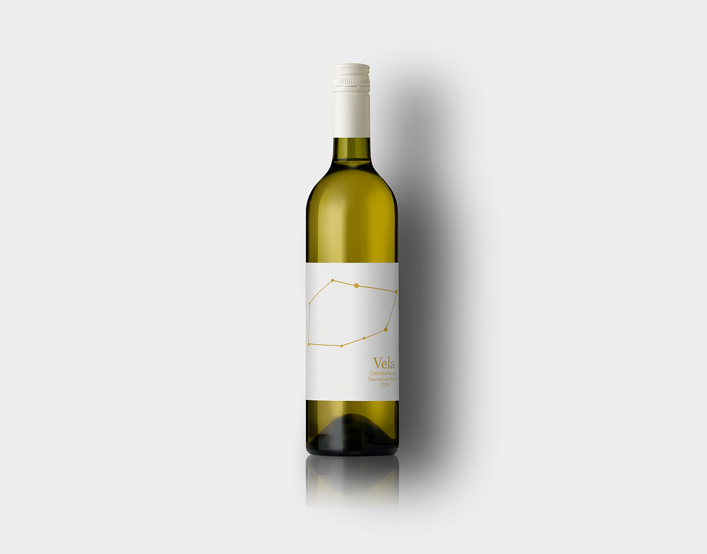

CELESTIAL WINES
This
wine label was created for the wine company Celestial Wines. The wine
label was based around the
constellations present in the sky at the time the grapes are harveste.
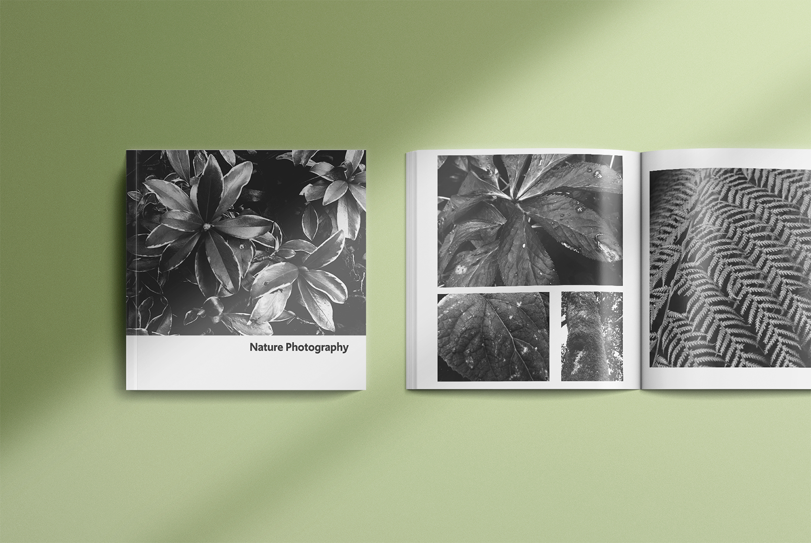
BLACK AND WHITE
NATURE PHOTOGRAPHY
These photos were taken as part of a catalogue of
black and white nature shots.
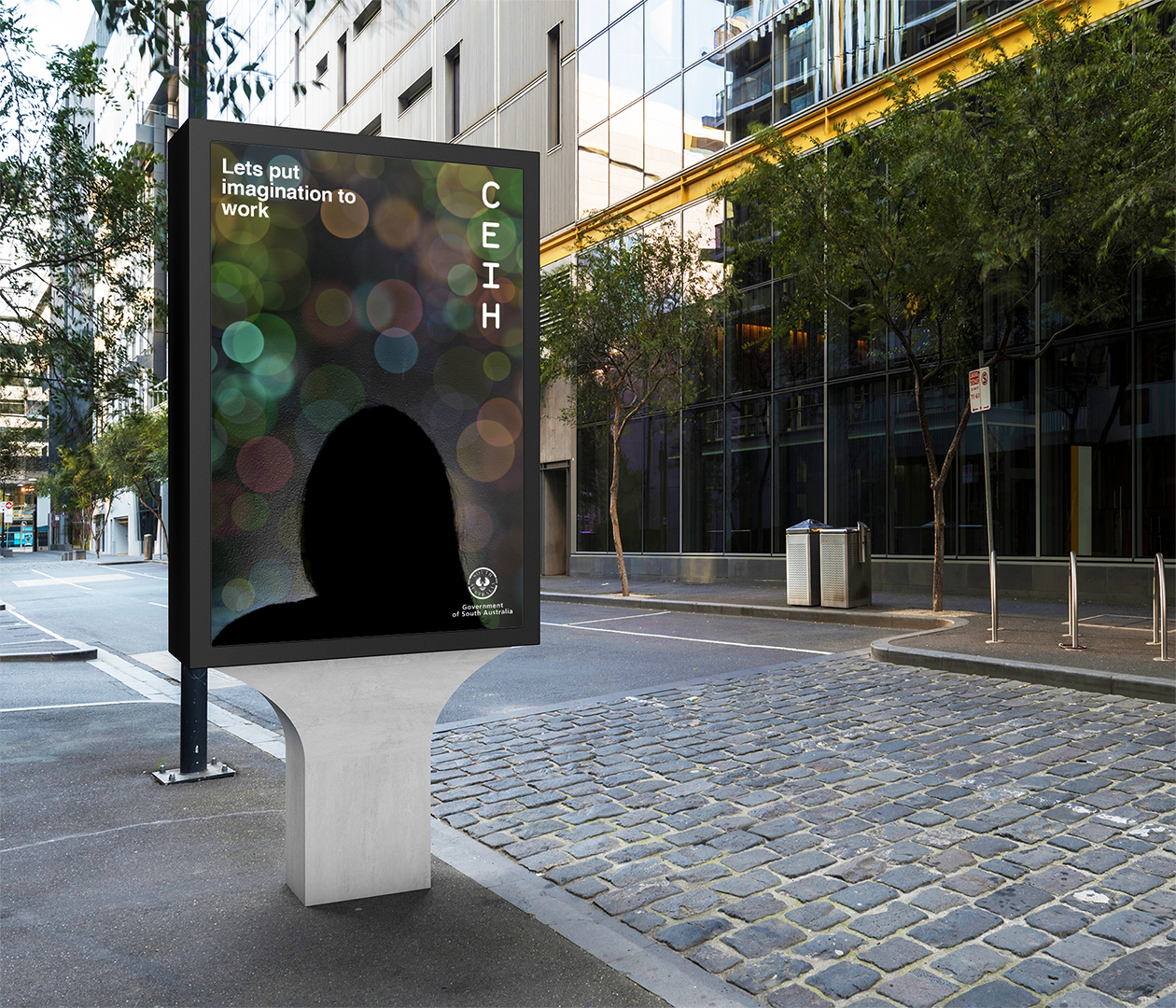
CEIH
This is a poster that was designed for the Commission on Excellence and Innovation
in Health. The title of this poster was called “Looking”. The image that was created is
an image that is intended to encapsulate imagination and spark intrigue in the viewer. The darkness in the image along with the contrast of the lighted dots has the ability to be interpreted in different ways by different people which I feel is something that is important to allow all different people to appreciate the image in their own unique way.
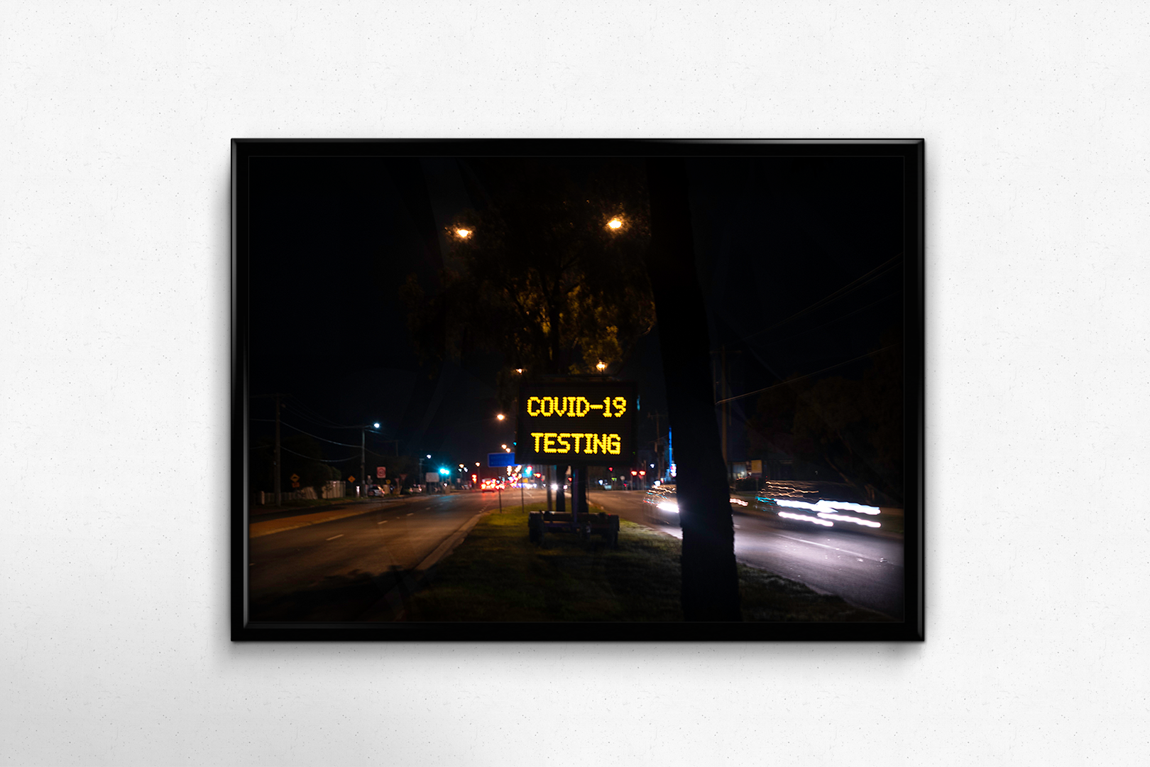
PHOTOJOURNALISM PHOTO
This photo was taken for the topic of photojournalism. The reason why I decided to take a photo of this sign is because COVID-19 is something that has affected everyone. It’s something that has decreased gradually in many parts of the world however it is something that is still affecting many. I decided to take a photo of this sign as this sign is something that has become a common occurrence due to the virus. I wanted the focus to be on the sign so the message on the sign is the sharpest part of the photo and the cars driving past represent how life has to continue even with a pandemic going on.
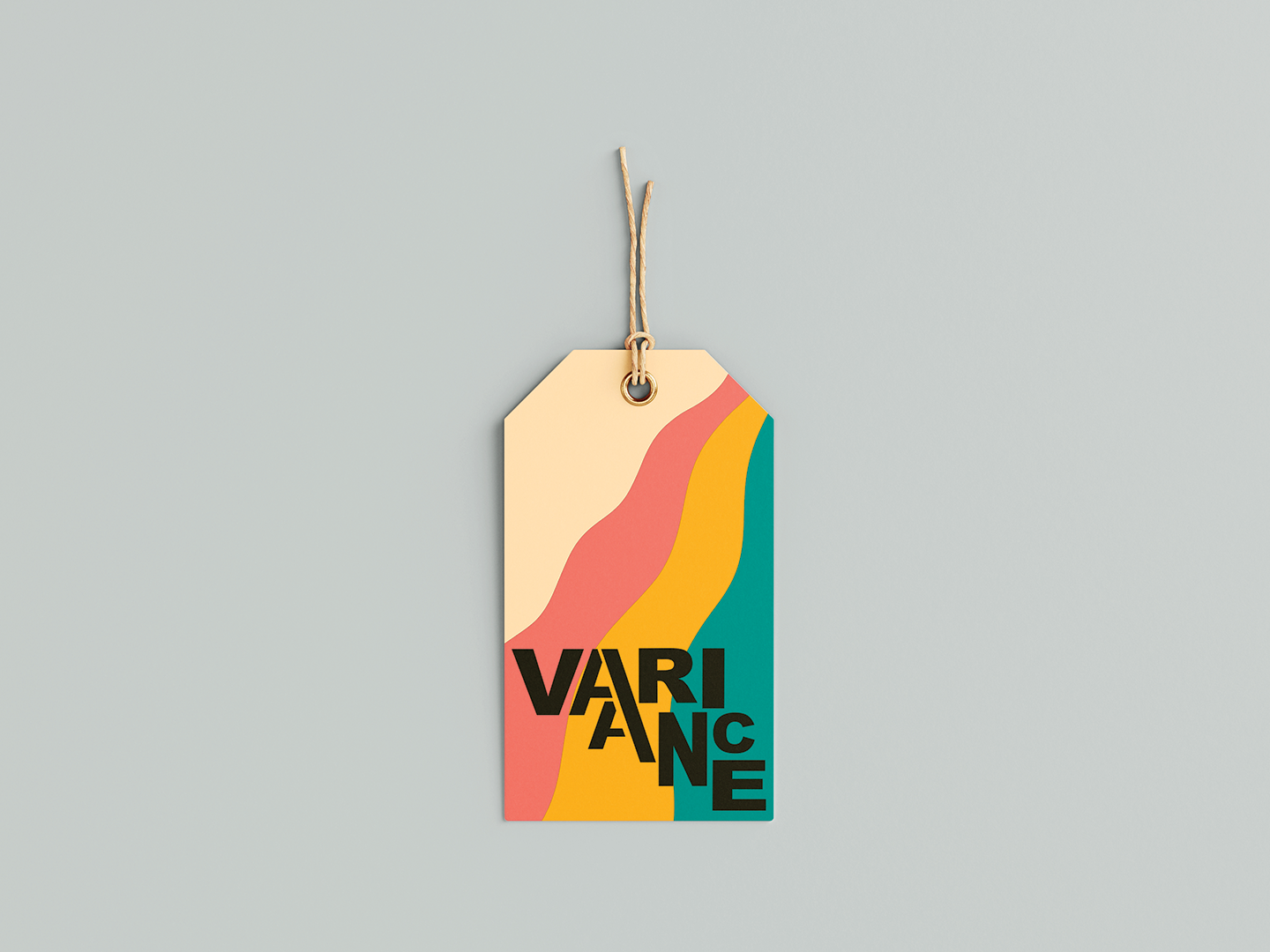
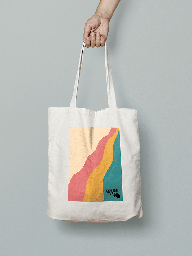
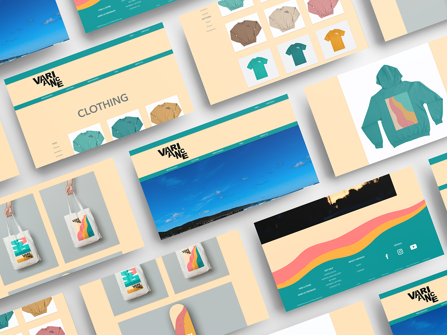
VARIANCE
These were some products for the campaign of an all-inclusive casual wear brand called Variance. Variance is a brand that focuses on celebrating diversity in all its forms.
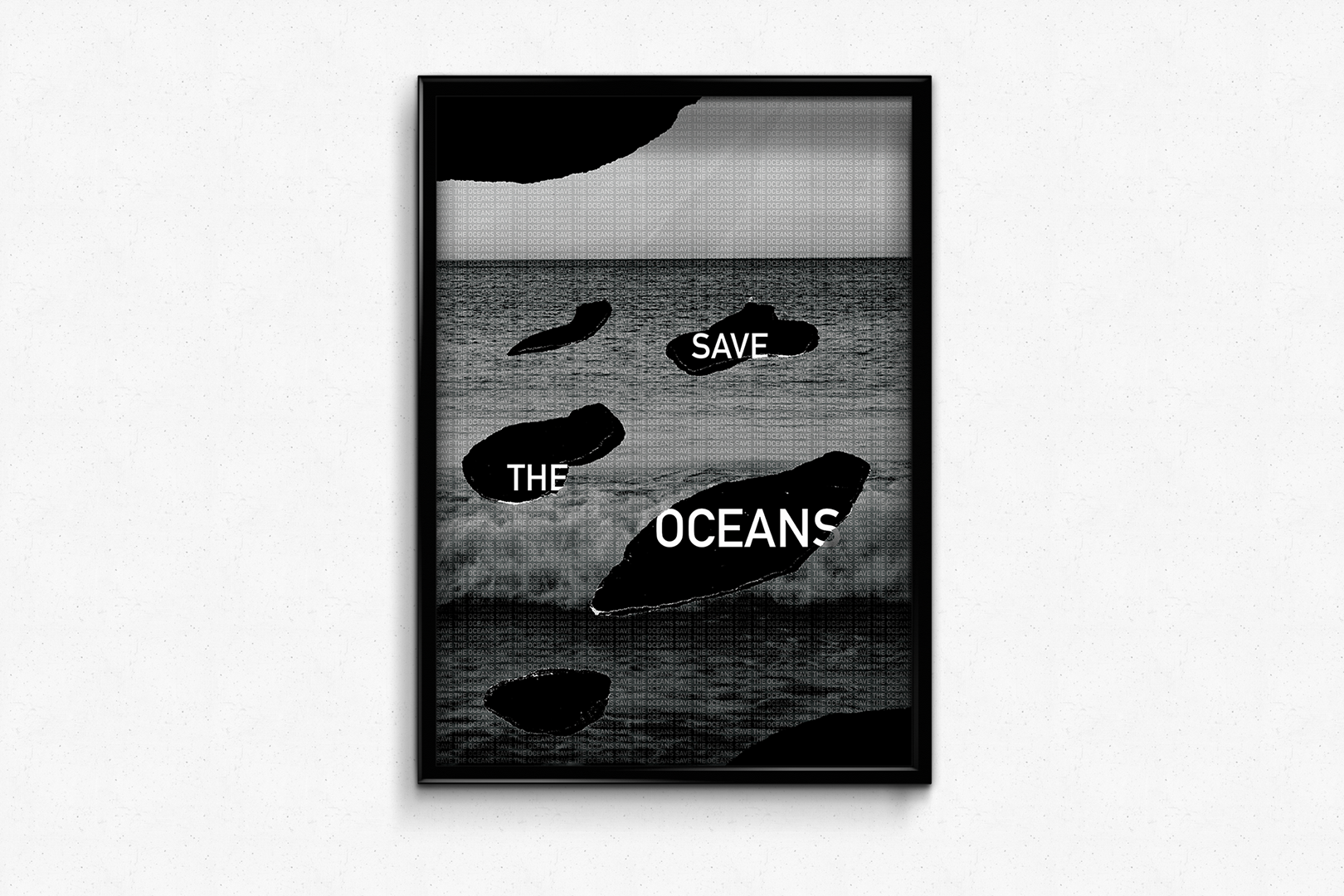
HONG KONG POSTER
This poster was designed for the Hong Kong Triennial Poster Competition. The theme that was explored in this poster was the preservation of our oceans and in particular saving our oceans from oil spills.
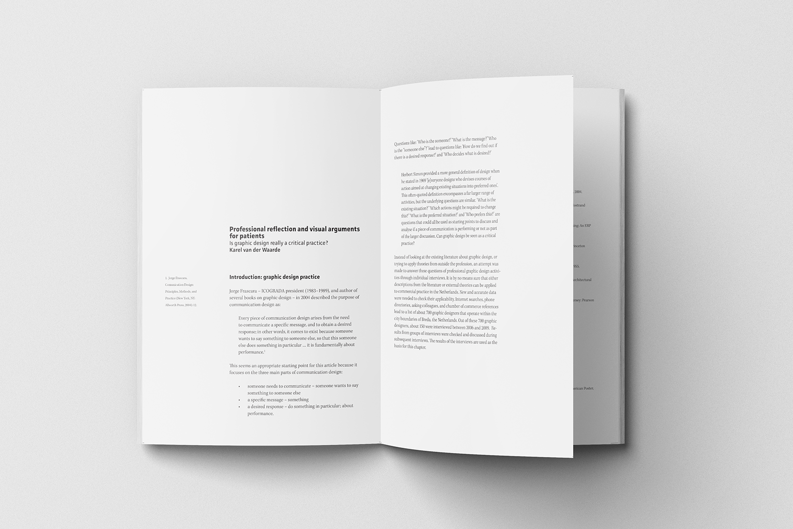
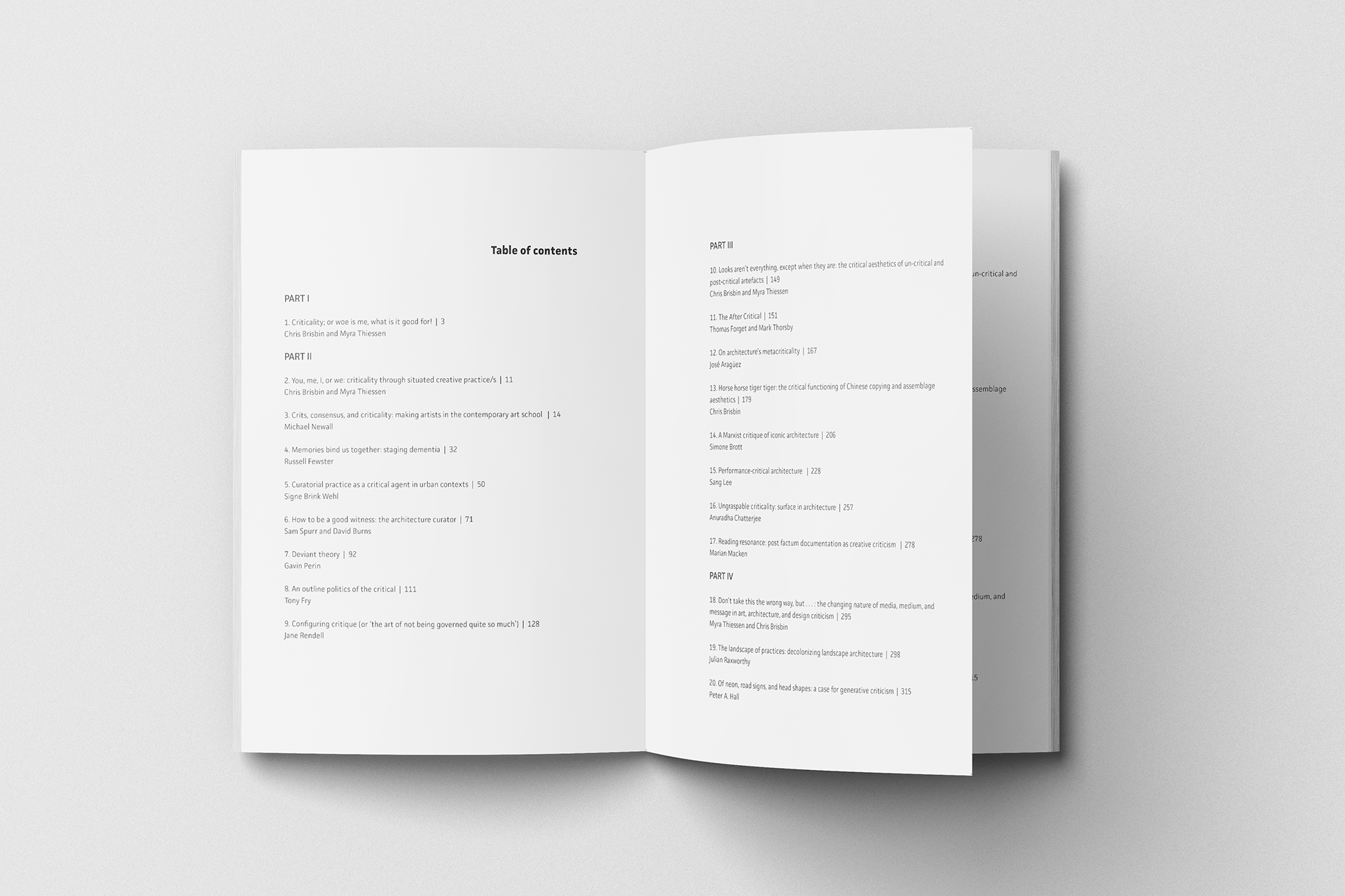
BOOK DESIGN AND TYPOGRAPHIC STRUCTURES
This was a booklet that was designed only using black and white typography with no images.
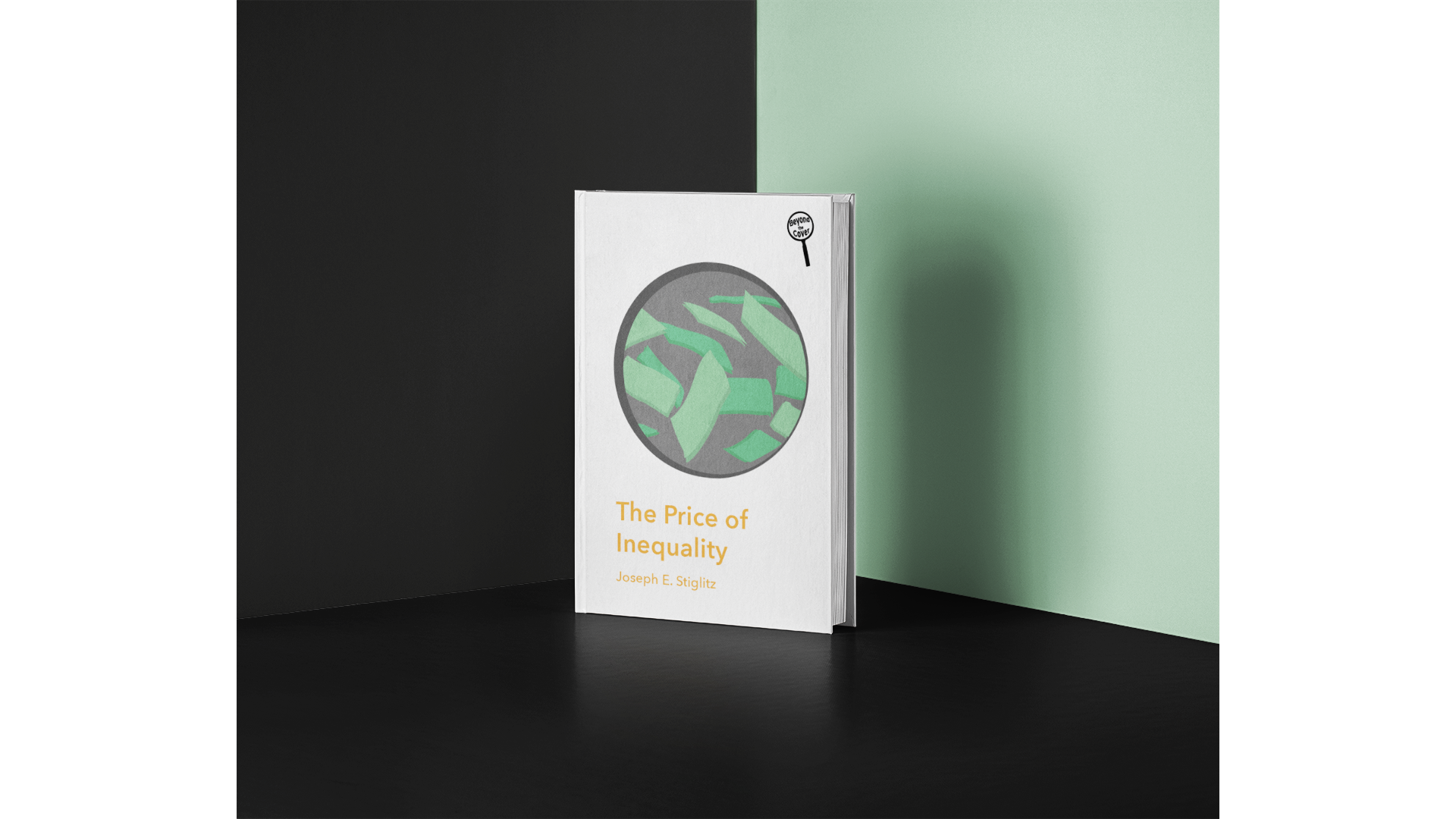
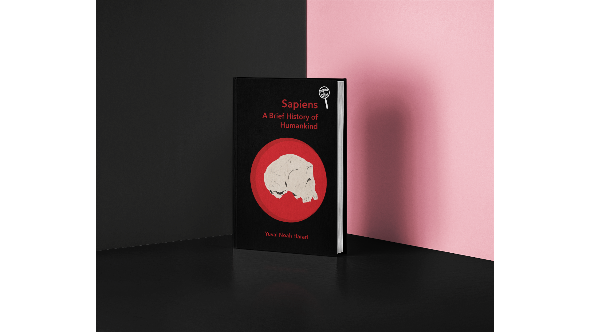
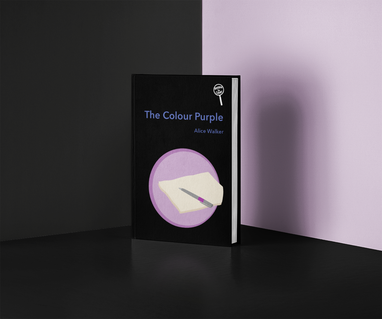
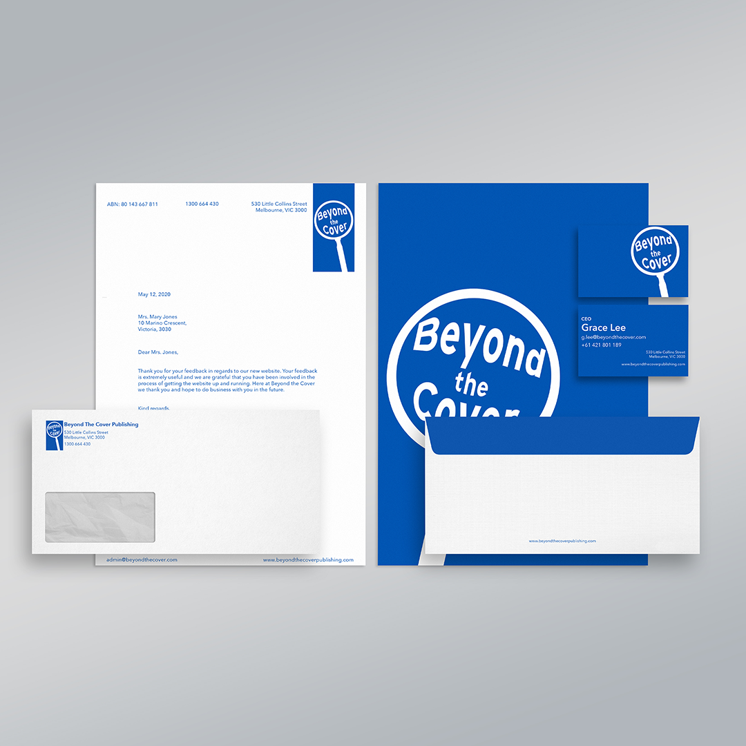
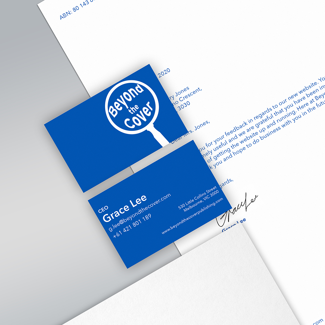
BEYOND THE COVER PUBLISHING
Beyond the Cover Publishing is a publishing company that focuses on publishing books that explore real world issues.