Sara Lacanale.
Hello,
my name is Sara Lacanale and I am a communication designer. I specialise in
publishing including but not limited to magazines and type, whilst exploring
combinations of colour and placement. Amalgamating these methods, I aim to
create work that stands out as individual and contemporary. I love the effect
design can have on products and projects and hope to use design as voice to
express and reflect on the social and cultural issues of today.
Interview.
Describe yourself in 3 words.
Bubbly, determined, quirky
Hobby outside of design?
In my spare time I try to paint as much as I can as it allows me to practice being creative without designing on the computer. Photography is something I do everyday. I have practiced photography for years and was able to showcase my skills into my assignments.
What type of design do you enjoy the most?
Over the last 3 years I have enjoyed publishing. Publishing is an area when I can design using my two area of interest’s typography and photography.
Who is your design inspiration and why?
My design inspiration would be Emily Comfort, a female designer who creates conversation by collaging photos. Emily Comfort collage designs are quirky and different yet not complex, but mainly enjoyable to look at.
Looking through your portfolio, what is one piece of work that you
are really proud of and why?
My most proud piece of work would be my research project, Luna. I loved how confronting and taboo the project topic was, which was something I had to get overcome. It was also really challenging creating a genderless menstrual brand that has been marketed to women our whole lives, but I designed a brand and product that I couldn’t be prouder of. It just proves that with design you can create anything, for anyone.
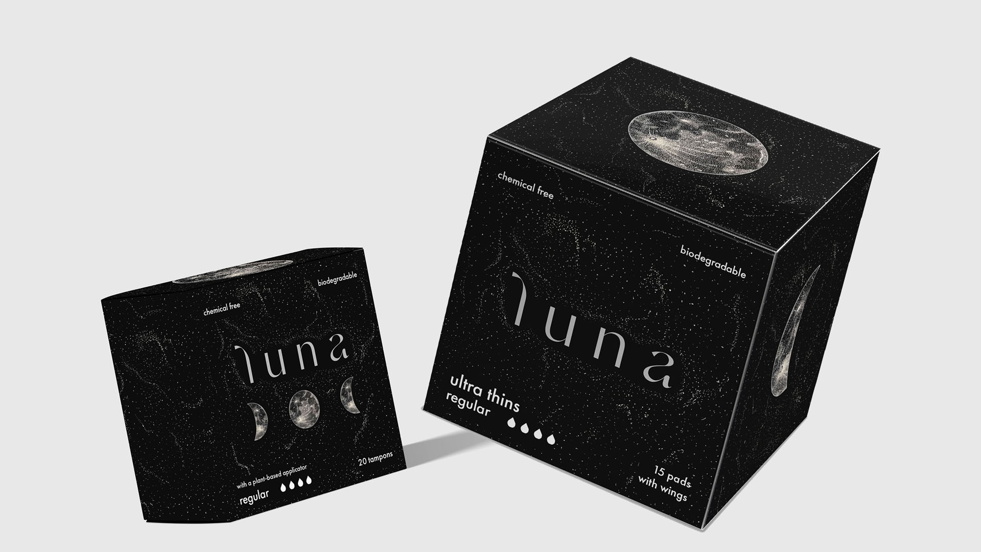
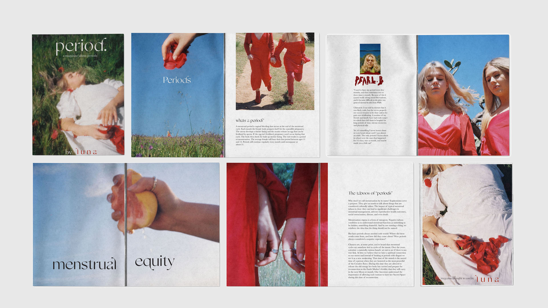
Luna, menstrual brand and zine
Luna. A brand that is not only a menstrual hygiene company, but creating a new society. For this research project I knew that I wanted to create something that would make an impact for someone. Luna will provide a complimentary gift box to students which will include a zine and a sample of our eco-friendly sanitary products. The zine will educate students on the taboo surrounding periods, following the topic of menstrual equity which refers to the access of sanitary products, finally introducing them to the new society that is moving toward an inclusionary menstruating identity, that extends past traditional notions of cis-gendered menstruating.
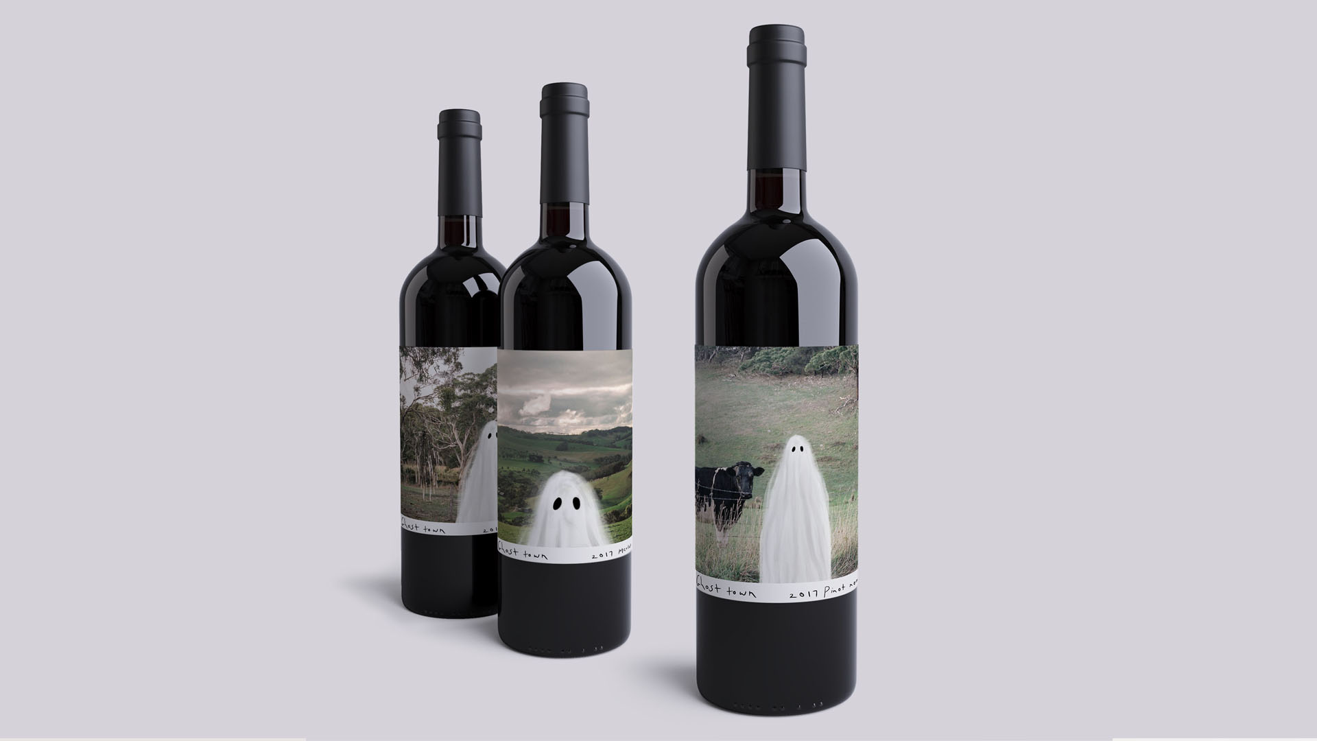
Wine
The winery I created was called Ghost town. The
three wine labels all include film images of the Adelaide Hills captured by me
and a ghost figure which I electrically illustrated. I set out my wine label as
a Polaroid having the film image and ghost pair perfectly together while having
a white bar at the bottom as an area to place my winery’s name, date and type
of wine. I did edit my photos, to add to the spooky theme. I had the ghost pose
differently on every bottle to add
contrast and character to my wine
label. 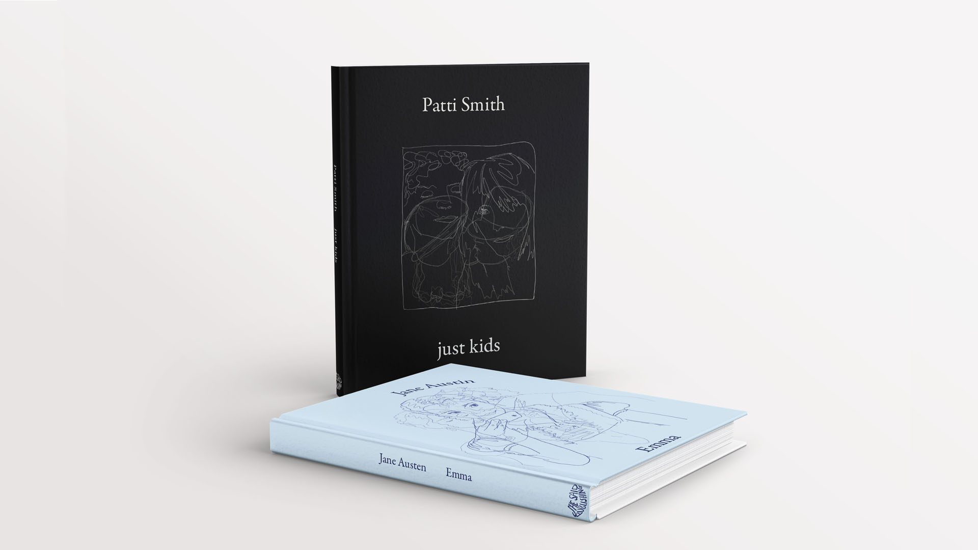
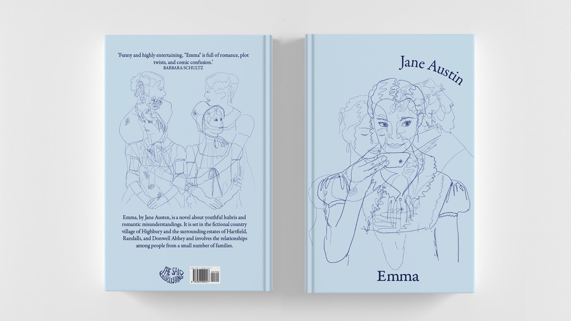
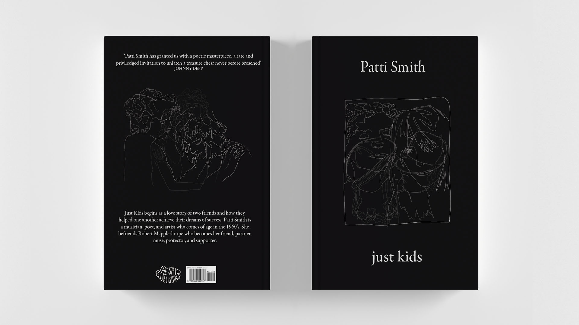
Book
She said publishing believes in educating and inspiring young
girls, through classic novels written by women. The audience ages ranges from
ten to sixteen. Through the years I have read many classic novels by authors
such as Virginia Woolf and Jane Austen who are also against this role that
women are meant to play. As my brand is associated with classic literature but
for a modern younger generation, I wanted to create a design that would combin
e
both styles.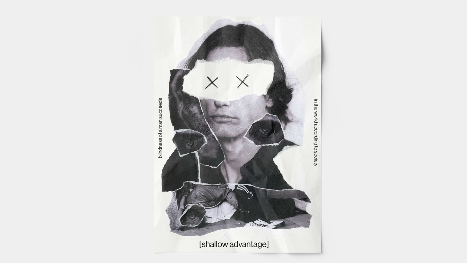
Hong Kong poster
The meaning behind my poster was to analyse today’s
society. We idolize the wealth and rich however, in order for people to succeed
in this world they turn themselves blind away from the truth of what gave them
their wealth and success. The creation
of the poster itself was metaphorical as the placement of images on top of each
other to show perspective and insight.

Photography
For my homage I decided to use a range of photos by
the photographer Petra Collins. Petra Collins is a Canadian film photographer
who focus her images on females. Collins was inspired by the true form of
females and wanted to capture a new perspective that would difference from the
sexualisation of females we see today. Collins photos are extremely soft and
dreamlike, the body work I will be focusing on for my homage is angels on earth..
The location of her images are very urban and ‘everyday’ locations, yet she has
transformed the locations to an angel’s playground. Petra Collins images
are very warm and have a very grainy filter that would be because the images
are taken on film. I love how there is a lens flare on every photo adds to the
angelic style of these images.