![]()
Ruby Scroop.
Hello, my name is Ruby. I am a communications designer that
explores the contrast and harmonies of colour combinations and bold type with the influences of modern in combination of older 90s graphic styles. specialising with identity branding and conceptual posters, being both diverse yet a very distinct aesthetic and
sense of visual appeal.
Phone: 0487 351 096
Email: rubyscroop@hotmail.com
Website: studioruby.squarespace.com
Social: @_studio_ruby
Interview.
Describe yourself in 3 words.
Humble, engaging and curious.
Hobby outside of design?
I don’t have a key hobby at the moment, but I’m looking to have one now that I have some
extra time, however I would say my small current hobby is drinking- coffee, gin, wine,
anything tasty :)
What type of design do you enjoy the most?
My work incorporates and explores the contrast and harmonies of colour combinations
and bold type with the influences of modern in combination of older 90s graphic styles.
Applying my style to work such as poster work, branding and identities, exploring how I
can apply bold surreal designs to our society.
Who is your design inspiration and why?
I often look up to studios rather than singular designers, these studios being MASH Design,
Studio OKOK and Frame Creative- all their work being full of contrasting colours and type,
engaging, simple, yet very cool.
Looking through your portfolio, what is one piece of work that you
are really proud of and why?
I am very much so proud of my wine labels and identify I developed for the project titled
“lush” wines. Developing and designing this concept helped me engage with what type of
design work I see myself working towards in the future, and helping me explore and
improve on my own design style, creating an outcome that is out of the ordinary, yet
something I want to push for to become the ordinary.
![]()
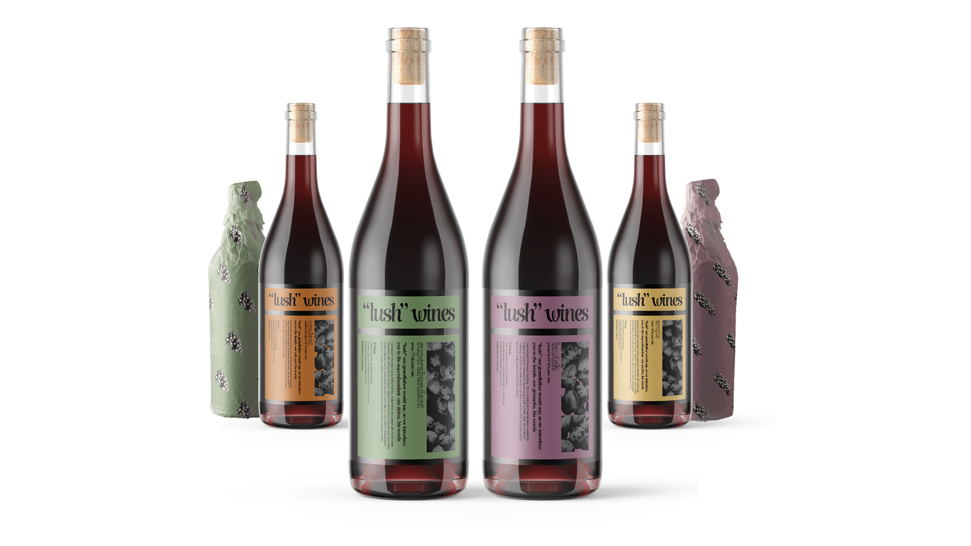
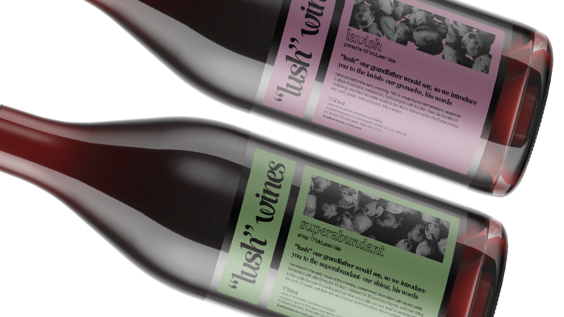
“lush” wines (winery concept and label
development)
“Lush” Wines revolves around a family owned business based in McLaren Vale, South Australia. Named after the grandfather’s property, constantly and very proudly always calling his vineyard “Lush”, the rst grapes being planted in the 80s, which refers to the
label design style. Passing the knowledge through to the younger generation, “Our winery,
his words”.
![]()
![]()
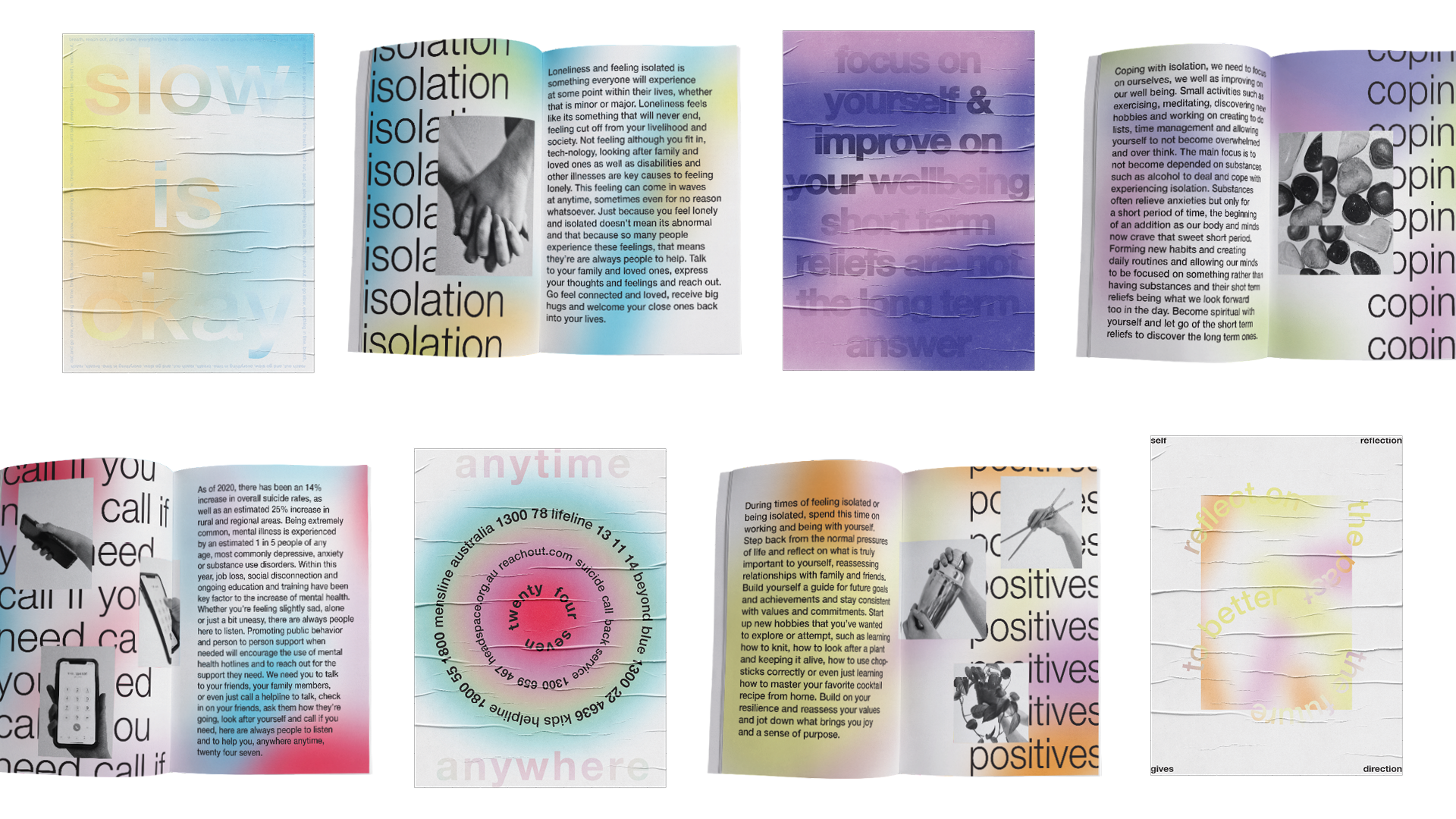
isolation zines (research project)
This series of small guides are to help those reach out to gain help or to just encourage those to further improve on themselves for those who experience mental or physical isolation. Being found in mental health clinics or at local cafes, to pass them on to loved ones or to keep for themselves as a personal reminder. These guides open up into posters which are encouraged to be pasted within homes and social settings.
![]()
![]()
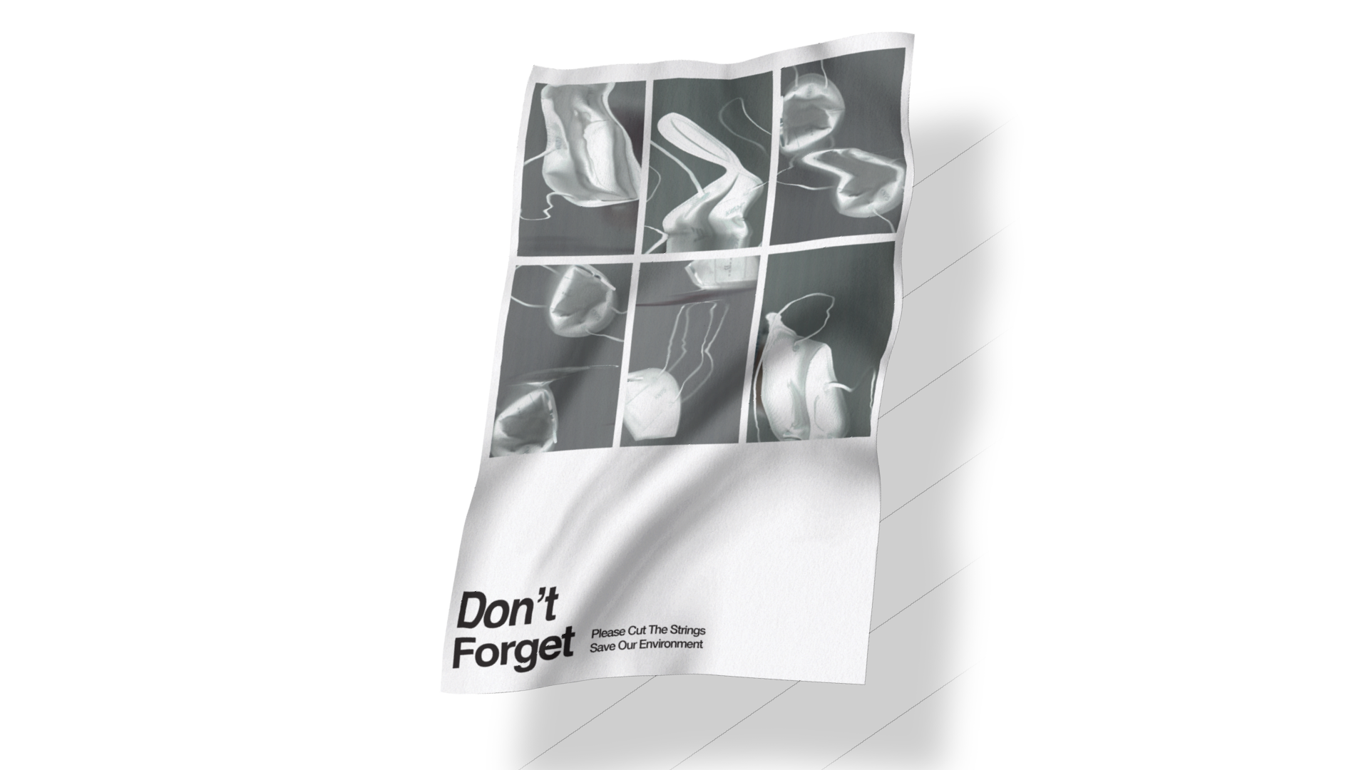
still & motion Hong Kong international
poster triennial 2020
Poster work developed for the Hong Kong international poster triennial, working with raising awareness on disposable face masks and the environmental issue they have
caused, while being a visually appealing communicative design is the aim of these poster
designs.
![]()
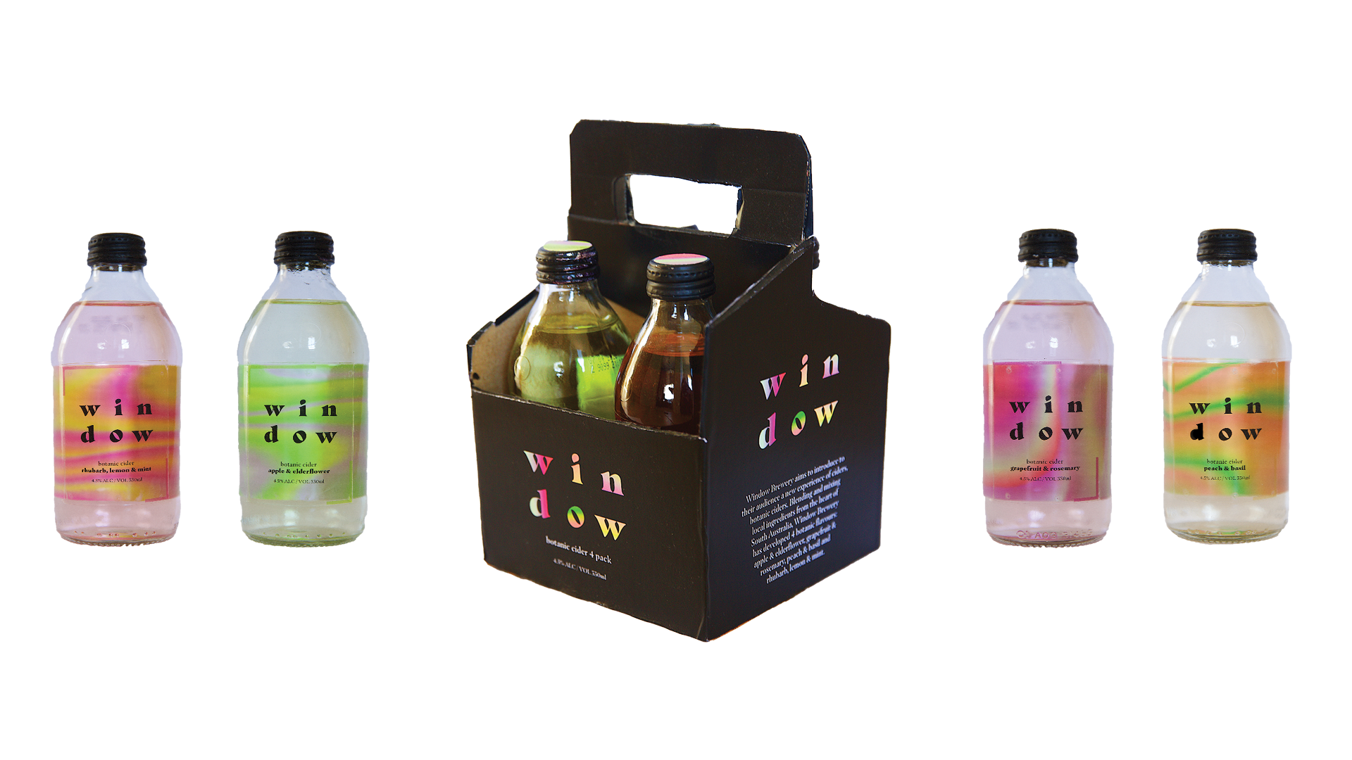
windows cider (identity and label
design)
Window brewery aims to introduce to their audience a new experience of ciders, botanic ciders. Blending and mixing local ingredients from South Australia, Window has developed 4 botanic flavours: apple & elderflower, grapefruit & rosemary, peach & basil and rhubarb, lemon & mint. Conveying the flavours and experience of the ciders, the design explores vibrant and rich colours to express this.
![]()
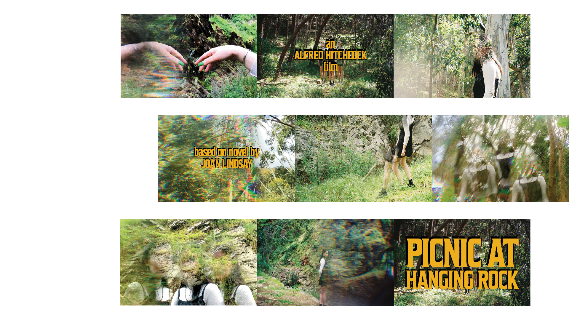
picnic at hanging rock (title sequence)
Set in the early 1900s, prestigious private girls school Appleyard College located near Mount Macedon in Victoria, the story follows school girl Miranda and her two close friends Marion and Irma who mysteriously vanish on a picnic field trip to scenic Hanging Rock. Reworking and setting the story in the 60s, the intentions of this title sequence were to highlight and enhance the aspects of what is real and what is surrealism and the constant mystery and suspenseful atmosphere throughout the entire storyline.
![]()
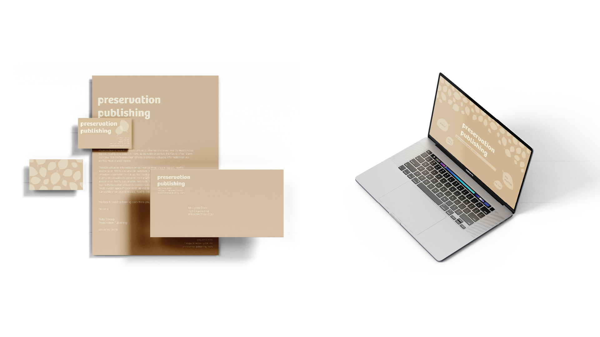
preservation publishing (book
publishing identity and covers)
Preservation publishing strives to provide valuable information on our worlds most crucial topics, readily available on 100% sustainable materials that can be recycled and are non threatening to the environment. The future of our earth is in your hands.
![]()
![]()